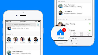
The Facebook Messenger app is about to be updated with a new design that also makes its inbox smarter.
The new look, which rolls out later this week, will change how the app's home tab is organized. Right now, it acts as a pretty standard inbox, showing all of your message threads with the most recent on top.
In the redesign, Messenger's home screen will still display some of your most recent conversations at the top — but it will also add more personalized information farther down.
For instance, a "favorites" section will offer up links to the people you contact most often. Upcoming birthdays will be prominently displayed, and an "active now" section will show you who is "available in the moment."
Though the new design may look like a subtle refresh, it hints at bigger changes coming to Messenger. As Facebook doubles down on AI, increased personalization throughout Messenger and Facebook will probably continue
It also marks the first step toward a more News Feed-like approach to Messenger — with more factors determining what each user sees when they open the Messenger app. And Facebook will likely add more sections to Messenger in the future than just those announced Thursday. Eventually, the company could add shortcuts in this part of the app to other Messenger features, like bots or its AI assistant, 'M.'
At a Wired conference in New York, Facebook's Vice President of Messaging Products David Marcus described the update as a "first stab at reinventing the inbox."
Source :http://mashable.com/


Out Of Topic Show Konversi KodeHide Konversi Kode Show EmoticonHide Emoticon